
The Mugs
Redesigning The Mugs’ website to mirror its creative and cozy coffee shop ambiance in order to entice new customers

ROLE
Sole UX/UI Designer
TIMELINE
1 month
TOOLS
Figma
Google Forms
Photoshop
Procreate
METHODS
Branding
Interaction Design
User Research
Visual Design
INTRODUCTIONThe Mugs is a coffee shop well-known and loved by locals.
The Mugs presents a wide-ranging and flavorful menu, served by friendly staff. Sunlit windows highlight the featured artwork from the local arts community. It truly lives up to its reputation as the place "where coffee meets art."

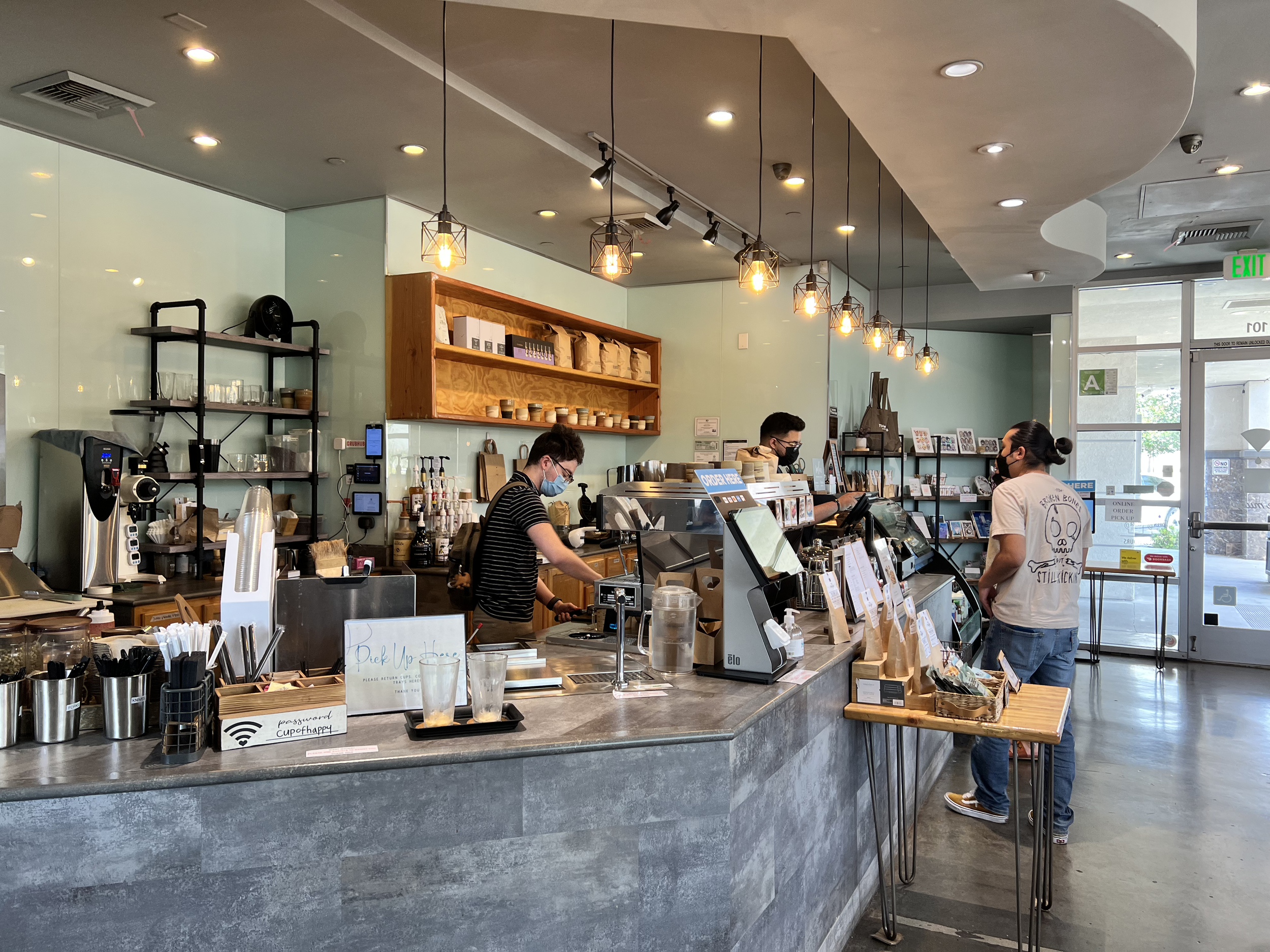

THE PROBLEMThe store has a growing in-person community as an “artistic coffee shop,” yet struggles to spotlight its diverse offerings and creative personality online.
The current website appears bare and doesn’t capture the unique artistic essence of the store, creating a disconnect among its users. Many individuals struggle to find information on the site, often resorting to other sources to find the details they need. This poses a challenge for new users who want to find out more about the store.
MY ROLE + THE SOLUTIONAs a loyal customer, I decided to build The Mugs a redesigned website in order to improve its usability and showcase its artistic charm to get more users engaging with the brand.
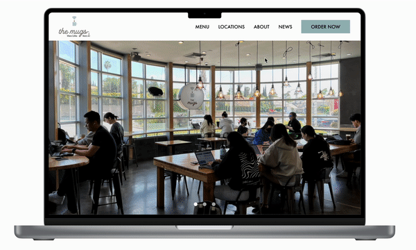
Exploratory Home Page Browsing
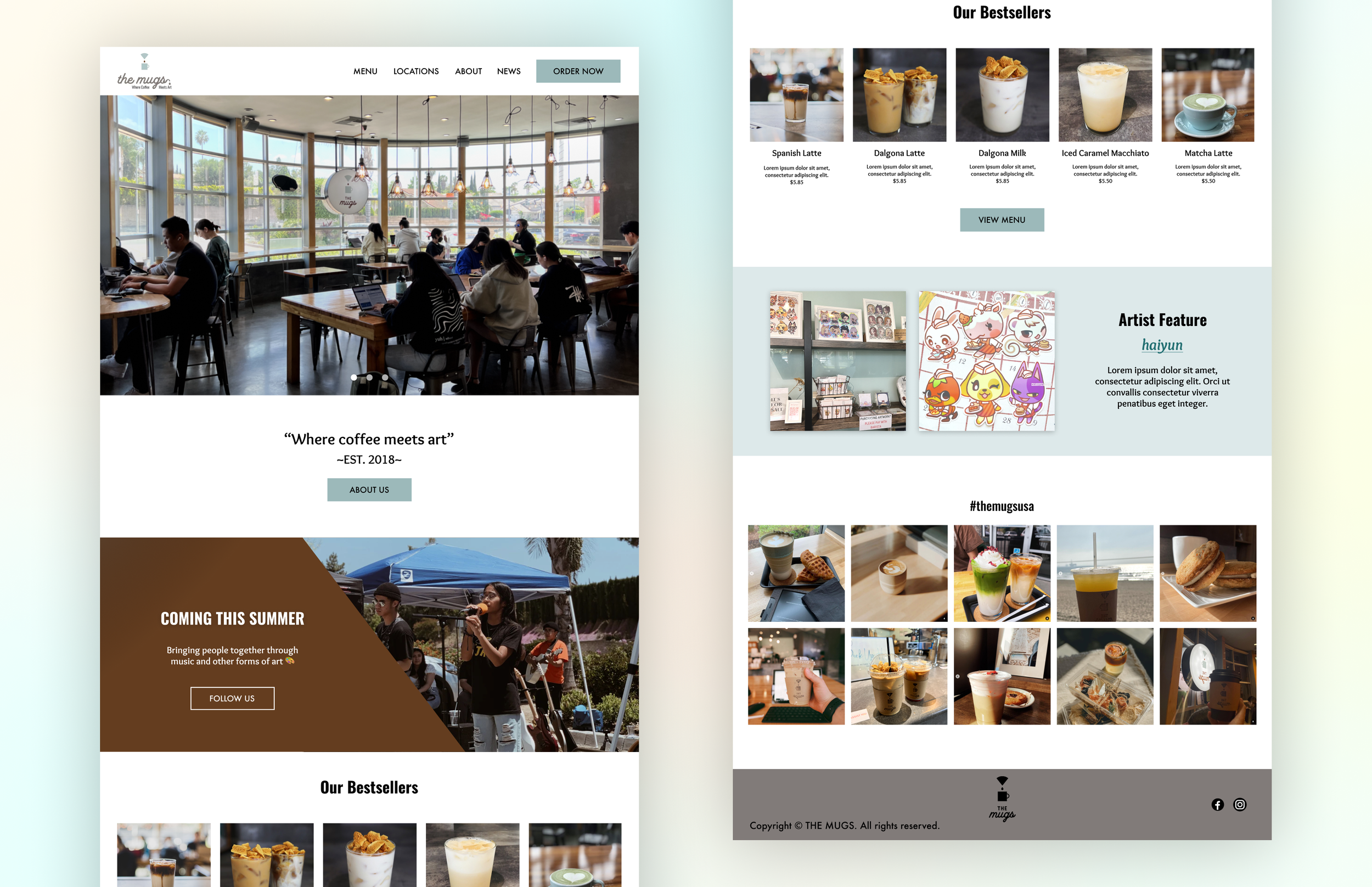
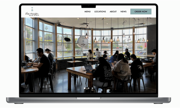
Mirroring the in-store experience, visitors to The Mugs' comprehensive homepage can easily explore various aspects using long-form scrolling. They can browse the diverse drink menu, explore the works of featured artists, and be informed of any upcoming events, just like if they were to walk in-store.
Discover Brand Identity
With a clear navigation system, users learn what sets The Mugs apart and understand its brand identity by accessing key information including its history, news, and community involvement.
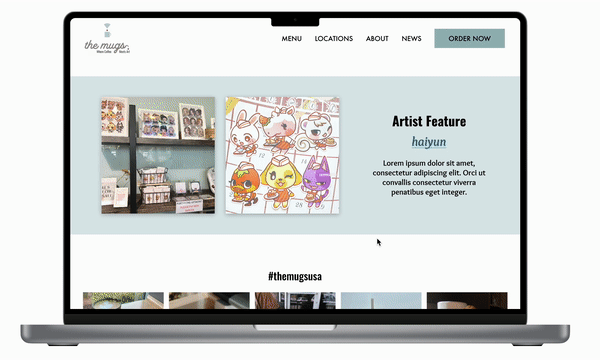
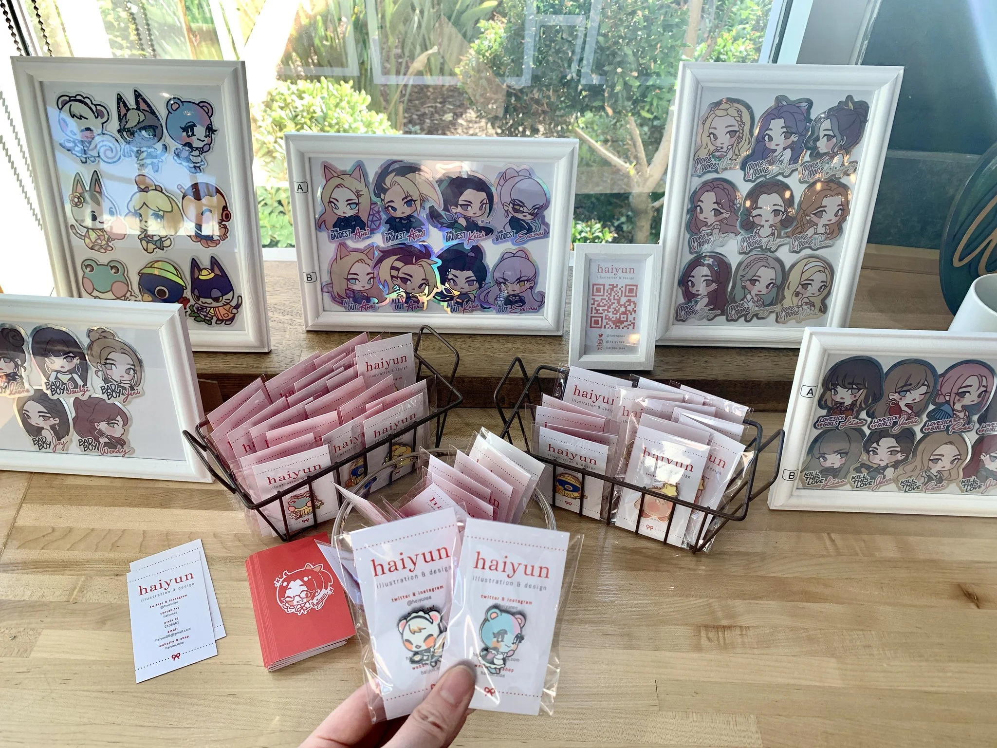
Curated Artists Section
Various sections on the website provide information about the featured artists of a given time period, including details about the artist's showcase, upcoming events, and product merchandise that can be purchased in-store.
HEURISTIC EVALUATIONThe current website feels barren and doesn’t showcase the store’s distinct offerings.
I conducted a heuristic evaluation to gather my initial thoughts and any areas of improvement. The existing website is dated and not user-friendly. The design is inconsistent, too. Notably, there results in a potentially high bounce rate due to the absence of easily-available information and a demanding user journey for users who want to find out more about the store.
USER RESEARCH70% of individuals reported that they frequent coffee shops for work or study, which makes it important that these coffee shops are easily discoverable online.
Understanding user needs and any points of friction they have will validate design decisions and set a direction for the project. Additionally, it will cater the most optimal design for their needs.
KEY INSIGHTSWord-of-mouth effectively leads new users to visit the website to learn more, but it falls short of users initiating action after that.

THE OPPORTUNITYHow might we transform The Mugs’ website to replicate its ambient in-store experience and showcase artistic collections, enticing new customers to explore and be motivated to visit?
SOLVING THE PROBLEMBased on the insights, the goal is to get more users to spend time engaging with the website.
This goal will be achieved through these 3 design objectives:

Objective #1:
Align the website experience with the in-store experience

Objective #2:
Highlight the ambient features that make The Mugs an ideal venue for work or study
Objective #3:
Emphasize the commitment to the local arts scene by providing detailed information on artists and upcoming events
SKETCHINGThe design became straightforward given the goal and objectives.
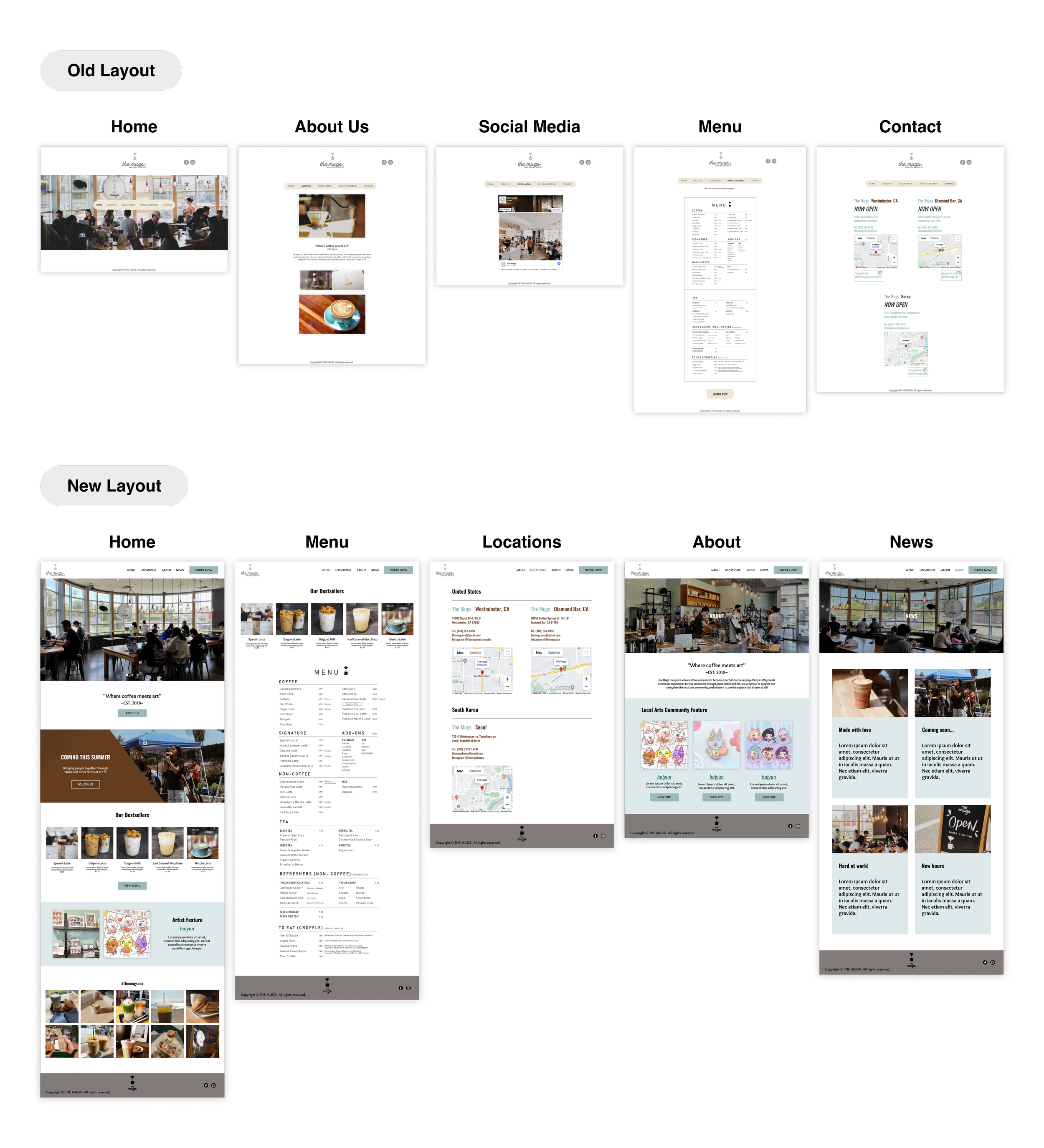
Existing website content and information hierarchy was kept and prioritized while new content was filtered to meet one or more objectives. After a few round of revisions, this is the final design iteration that I decided to build.
An annotated sketch on ProcreateIDEATION + VISUAL DESIGN DECISIONSI followed up the sketch by creating an intuitive navigation for the prototype.
Following the initial sketch, I translated the design over to Figma. I tested a few variations before landing on the below image, with notes to elaborate on the visual decisions made.
Mid-fidelity wireframesA responsive layout of the landing pageTESTING + IMPROVEMENTSI conducted a usability test to ensure that the user flow was logical and to bridge any gaps during testing.
My goal was to collect user feedback, assess the ease with which volunteers completed assigned tasks, and measure their overall satisfaction with the task experience.

The Final Product
REFLECTIONSI felt proud of my work in contributing to a brand that I personally recommend and want to see flourish.
Some things I learned:
Visual branding and design require being meticulous and strategic. Using existing design patterns, I tactfully tweaked their color scheme and fonts to meet WCAG standards for accessibility. Where there were new patterns, I experimented with various colors and shapes to encapsulate their cozy, artistic, and creative aura.
The presence of trade-offs are inevitable, so it is crucial to think critically. Keeping business objectives in mind, I initially integrated a Facebook embed to streamline their social media updates on two platforms. However, this did not scale well in responsive layouts. Instead, I created a new UX pathway on the top navigation called News. While this may demand more effort and monitoring from the business, it fulfills user objectives in engaging with the site more effectively.
NEXT STEPSIn contact with the manager…👀
This project will be packaged and pitched to the store manager for a collaboration.