GamerMeetups
Building an organizational tool for gamers to seamlessly coordinate schedules and cultivate virtual connections

ROLE
Sole UX/UI Designer
TIMELINE
1 week sprint
TOOLS
Figma
Google Forms
Zoom
METHODS
Information Architecture, Interaction Design, Prototyping, UI Design, Usability Testing, User Flows, User Research, Wireframing
INTRODUCTIONGaming is a fun and convenient way to hang out with friends in the digital world.
Gaming has become more than just a hobby. For gamers aged 18-35, it becomes an avenue to connect, laugh, and create memories with friends, especially when physical meetups are less frequent.
Important things to note in this case study:
‘Gamers' refers to anyone who enjoys games, regardless of commitment level, and not limited by a specific console or platform
While some gamers prefer playing solo, either due to the game’s inherent single-player design or the competitive ranked ladder being solo-only, this study primarily focuses on those engaged in versatile multiplayer games
THE PROBLEMAs an avid 20-something gamer, coordinating games with friends seems impossible due to conflicting obligations.
In our busy adult life, the real challenge isn’t the game itself, but coordinating times to play amidst growing responsibilities. Balancing work, personal life, and other events, often means spontaneous gaming sessions becomes a rare luxury.
THE SOLUTIONGamerMeetups is a two-fold experience for gamers to plan games together and cultivate virtual connections.
USER RESEARCH + KEY INSIGHTSGamers prefer to play with friends and most play less or quit when they can’t.
Utilizing surveys and interviews with 5 fellow gamers on Discord, I found these common pain points:
Wanting to play with friends but not knowing when people are available to play
Feeling lonely from being left out due to personal or work obligations, or being unaware about previously set gaming times
Facing stress of being the primary coordinator, necessitating multiple 1:1 conversations to align schedules, especially for larger gaming events or group games
For example, arranging 8 players for Lost Ark raiding or organizing regular practice sessions for the VALORANT Game Changers Academy tournament
100% of gamers reduced their time in games requiring coordination when they couldn’t play with friends, due to feeling disconnected from its social aspect and the challenges associated with organizing and synchronizing gaming sessions.
COMPETITOR ANALYSISWhy not use Discord?
Discord is a preferred social platform for gamers, offering voice calling and instant messaging. It addresses the need for connection by providing the opportunity to make friends, join servers, and communicate in direct messages or channels.
An example of the multiple servers/communities I'm inWhen attempting to organize an event on Discord, the platform shows its limitations. Gamers must actively monitor and respond within the time frame to confirm their availability. Moreover, the organizer faces challenges in keeping up with everyone’s responses, especially as messages accumulate or if some gamers remain unresponsive.
THE OPPORTUNITYHow might we design a platform for gamers to seamlessly coordinate schedules and cultivate meaningful digital connections with friends?
WIREFRAMES + USABILITY TESTINGBrainstorming standard components in calendar apps, I delved into crafting low-fidelity wireframes to determine feature prioritization.
My goal was to create several wireframes for usability testing to gauge their intuitiveness.
Low-fidelity prototype used for initial testingDuring testing, I discovered that participants’ mental models influenced their approach to accessing specific features. They each utilized unique pathways to fulfill tasks.
IDEATION + SOLVING THE PROBLEMI decided to solve for convenience.
Evidently, a scheduling app for gamers might seem straightforward. However, to ensure the app’s success, it’s crucial to cater to users’ need for convenience.
ITERATIONS + IMPROVEMENTSBased on user feedback, I updated the low-fidelity wireframes to better inform the high-fidelity design process.
I streamlined the user navigation to prevent misconceptions about the purpose of the app.
I relabeled navigation like so to be more familiar to gamers:
Messages → Chats
Schedule → Meets
I removed Calendar and the Friends List from the Profile page and instead emphasized direct access to Meets and Chats in the bottom navigation.
I added Groups to spotlight user-centric communities over generic social connection. Groups and Chats, despite their social connotation, are functions that facilitate creating Meets and centralize scheduling tasks.
I incorporated visible feedback into the updated design.
Displaying confirmation status of whether someone is a Friend enhances usability, protects user privacy, and establishes trust in the system. Finding friends in the app is for organization and creating events, rather than operating as a social platform.
Providing a consistent user experience is key to creating intuitive interactions.
With access to contextual information, users experience less cognitive load when deciding whether to add their acquaintances. Compared to the original design, the new layout offers better interaction capabilities, fostering intuitive interactions.
INTERACTION DESIGNDesigning for direct access within hierarchy and navigations.
To address the potential misconception of this app being social, Chats are designed to facilitate communication within Groups in aligning schedules and defining goals. When a Group schedules a new Meet, the corresponding Chat is instantaneously activated.
New Groups can be created from either the Chats or Meets tabs, leading to specific chat interfaces. However, while every Group associated with a Meet will have a Chat, not every Group with a Chat will necessarily have scheduled a Meet.
Due to the interconnectedness of Groups, Chats, and Meets, and the varied intuitive pathways that participants took to complete their tasks, I developed the flows with multiple entry points within the navigation structure.
PROTOTYPING + USABILITY TESTINGI conducted a final test on the high-fidelity version to identify any last changes.
100% of gamers would gladly welcome this app into their routines so that they can stay connected with friends despite their hectic schedules.

The Final Product
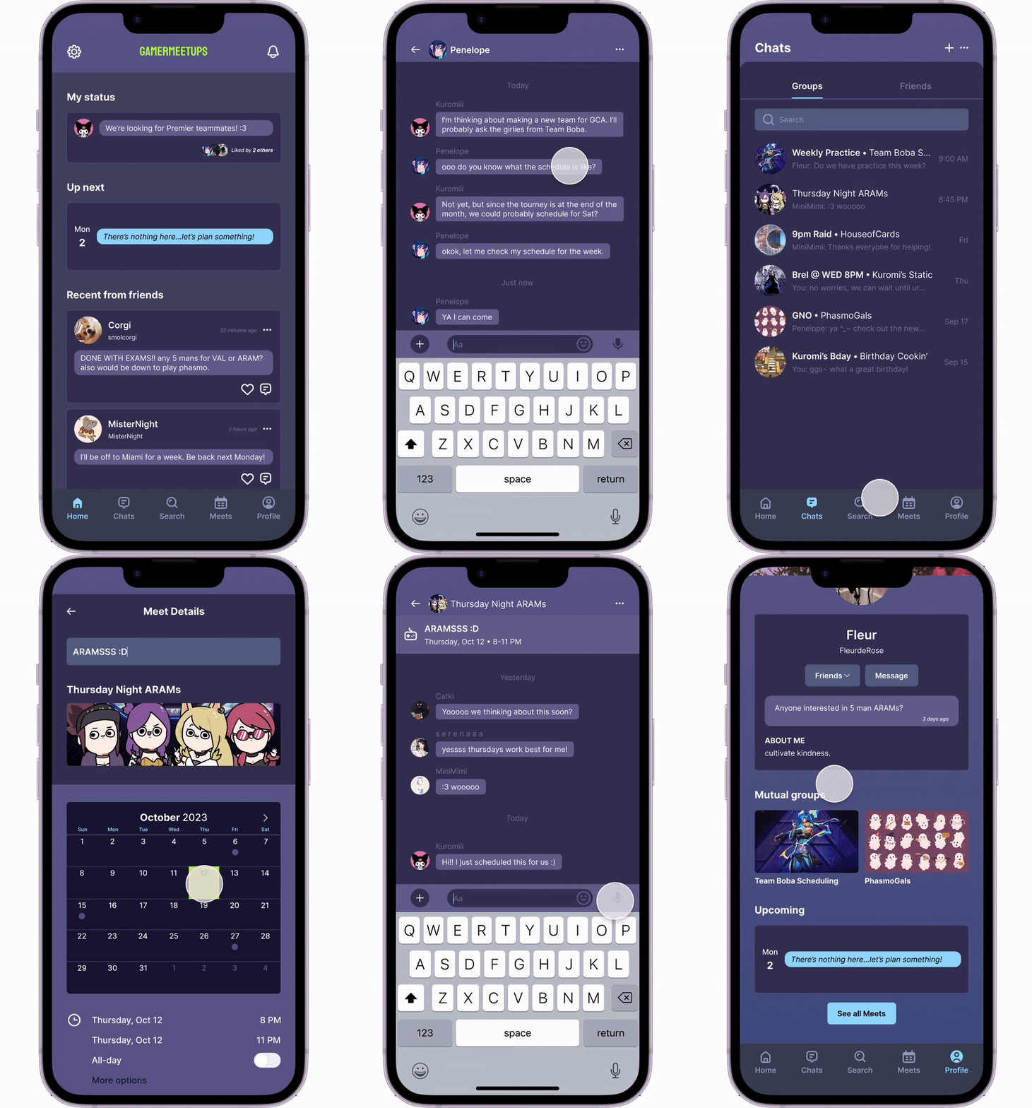
Gaming Activity Stream
Centralized feed displays the most recent updates
View live gaming activity and receive invites
Never miss out on the latest activity
Plan Gaming Sessions
Coordinate and create Meets with gamers
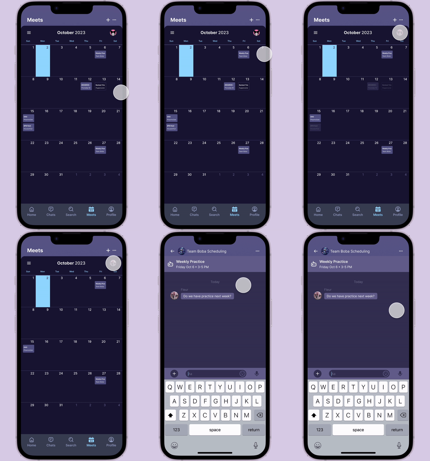
Meets will activate corresponding Chats for the event or prefill with details in existing Chats
Leave a message in Chats to update your friends
Communication Hub
Discuss scheduling and confirm details in either the Groups or Friends tab
In-app messaging simplifies organization
View Meets details stickied on top so everyone is aware
Connect with Gamers
Discover and engage with new players in groups or add those you frequently play with
Easily find and invite friends
Check for mutual Groups
Compare Schedules
Browse friends’ calendars by switching profiles
Find available times to play games by comparing Meets
Cultivate relationships by staying mindful and considerate of schedules
REFLECTIONSUsability testing was invaluable in every step of the process.
I’m super proud of this project as a passionate gamer who struggles with the very real problem I stated. Some things I learned:
Narrow down the scope. There were many directions that I could’ve taken this project, but performing early-stage usability testing and gleaning insights from research empowered me to hone in on the important aspect of convenience and guiding the project’s direction. Moving forward, I learned to prioritize testing and the insights from testing to make data-driven decisions.
Sometimes, less is more. I opted to remove specific elements to prevent the app from being misinterpreted as a social platform. While it might be counterintuitive to subtract rather than add, making trade-offs is fundamental in the design process. It’s equally important to know when to defend such decisions as a designer.
NEXT STEPSLooking to add more flows…
I plan to build out the following functions:
Group Creation Flow
Integrated Search
Status Updates
Black-out or Block-out Time
Time Zone UI
Privacy Toggles


